How to create successful graphical abstracts?
A 10 simple rules educational series
Matthias König 
Humboldt-Universität zu Berlin, Faculty of Life Science, Institute of Biology, ITB
University of Stuttgart, Institute of Structural Mechanics and Dynamics in Aerospace Engineering
February 10, 2026
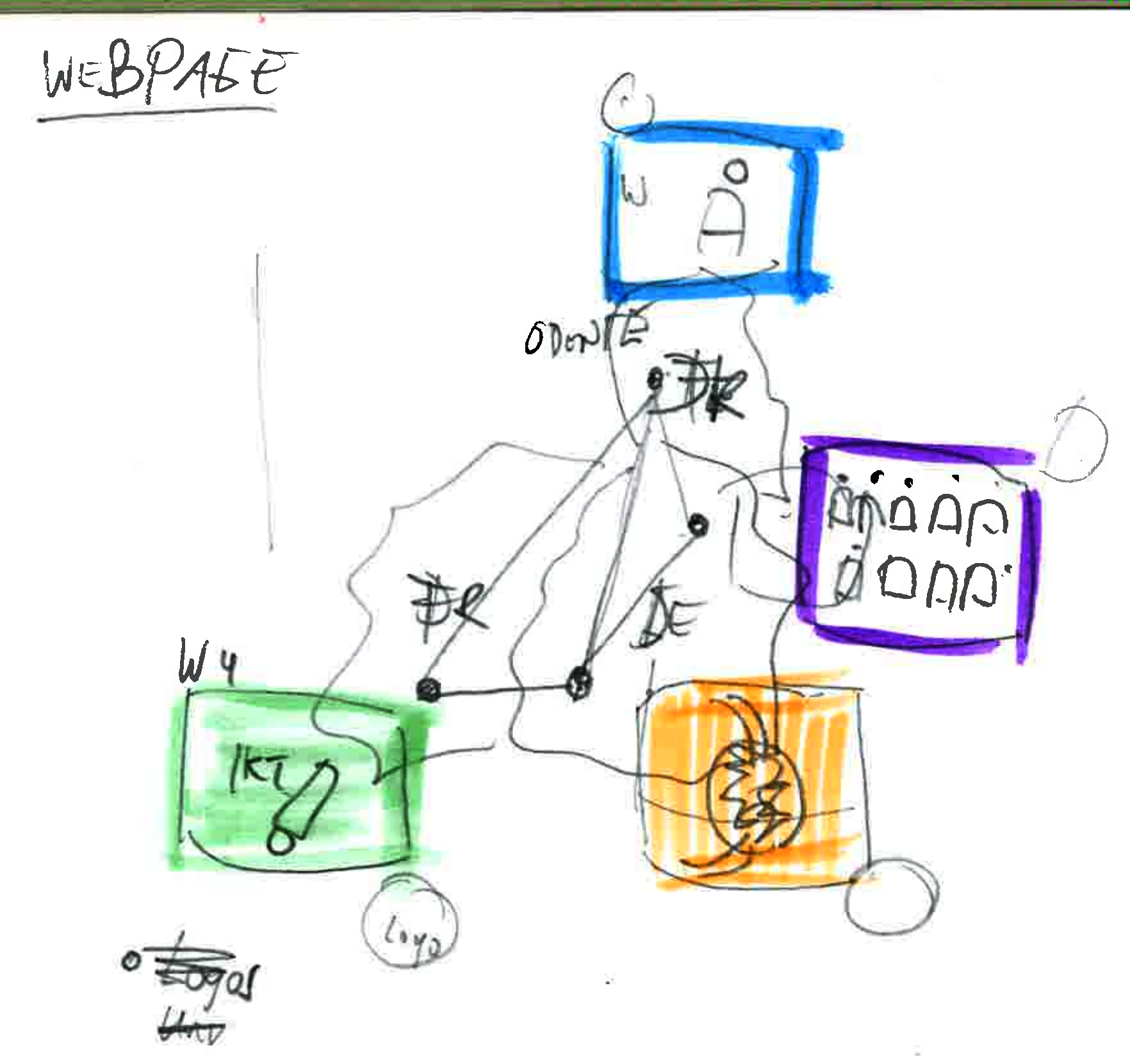
1: Key message for audience1
What do you want to show?
- Write down the key message in one sentence
- Doodle around on paper
- Shorten down the abstract to one sentence (conclusion)
- ChatGPT
Actionable items
- Take an example of yours and define the key message
2: Pictures and pictograms
Key components are visual elements.
- Mostly pictograms and symbols
- Simple shapes
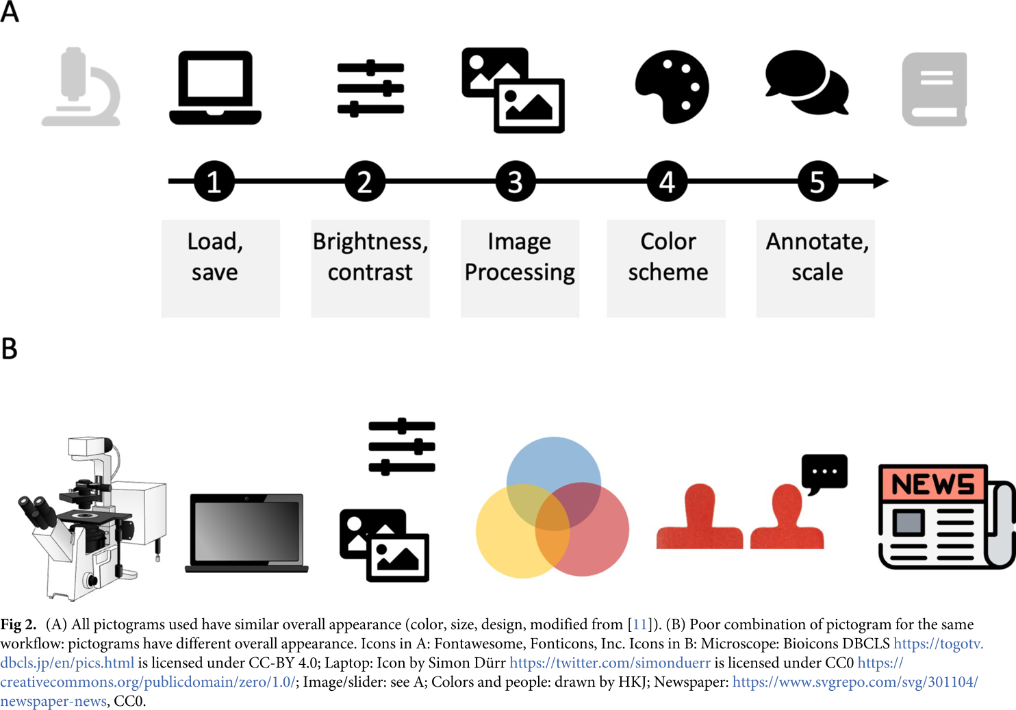
- All icons should have similar overall appearance (consistency)
Actionable items
- Explore icons: Fontawesome, Nounproject, EBI, Bioicons, Health Icons, Biorender
3: Data and charts as key visuals
When pictograms are not enough.
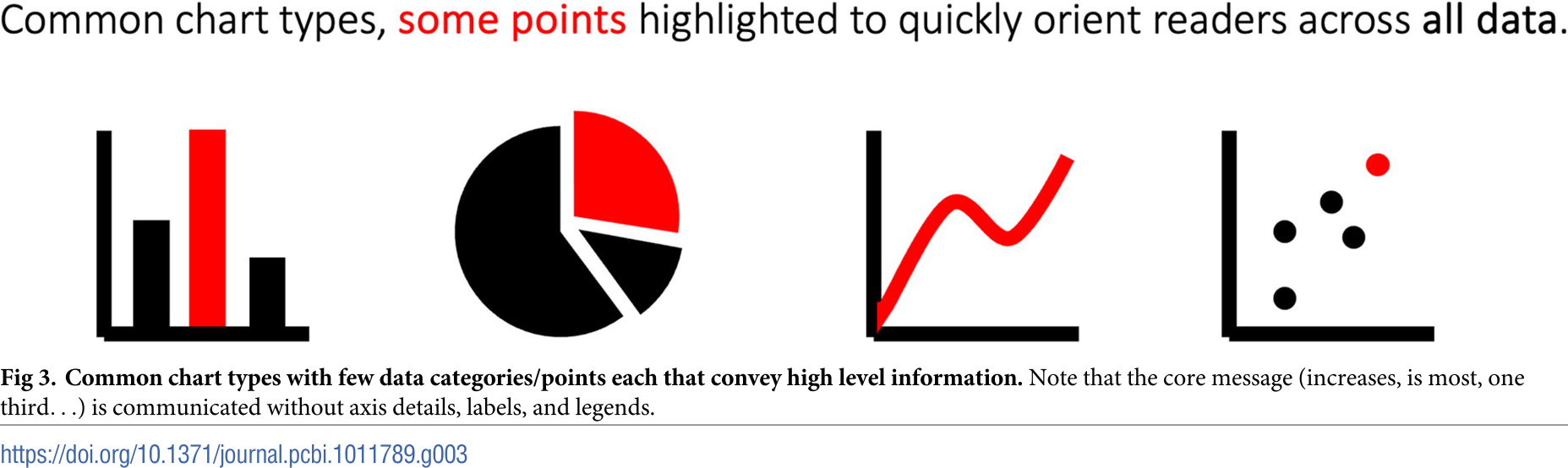
Actionable items
- Create minimal chart from your key results
- Explore chart types and their use: Data Visualization Catalogue
- Medical, microscopy, or photo images are often self-explanatory
- Most of us understand bar charts (and pie and line charts)1
- Omit details (tick marks, legends, labels, …)
- highlight specific methods with domain-specific plots (e.g. t-SNE, Forrest plots, Vulcano)
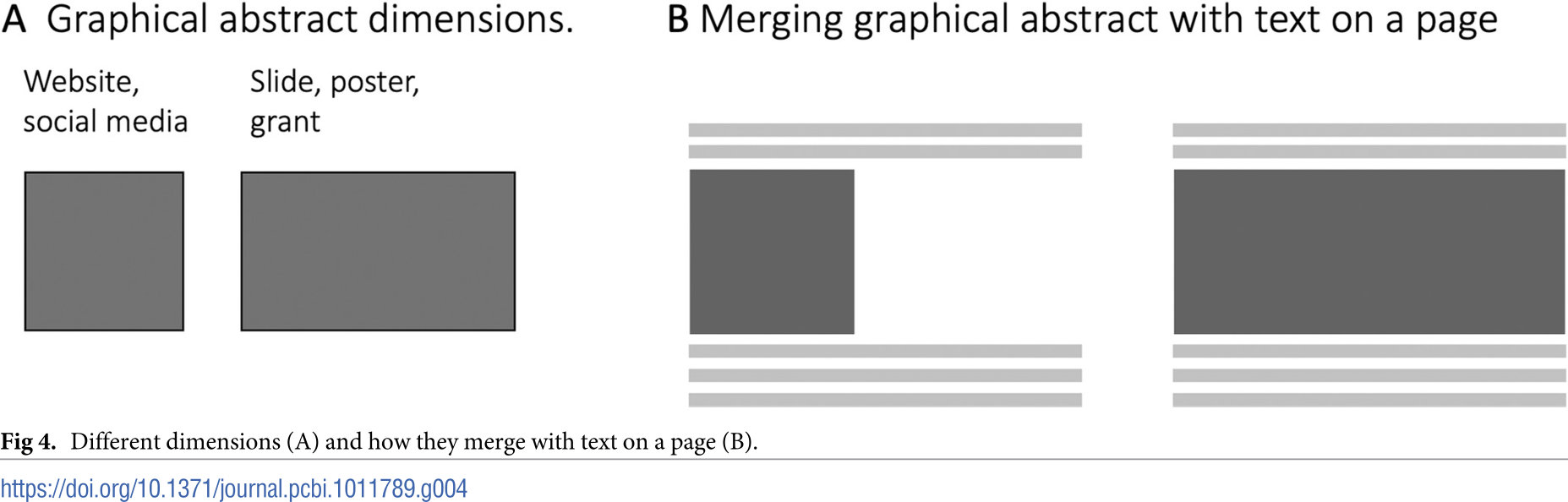
4: Layout: The dimensions
Where to put what?
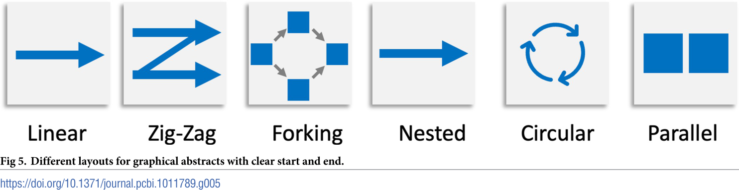
5: Layout: Reading directions
Where is the entry point, how do you scan?
Actionable items
- Figure out the reading directions of the latest figures you created
- Where is your entry point?
- Provide clear entry point
- Typical direction: left to right, top to bottom
- Arrange elements in reading order1
- Linear processes or workflows work well in linear chain
- Parallel layout for contrasting elements
6: Connecting the elements
Arrows and arrangements
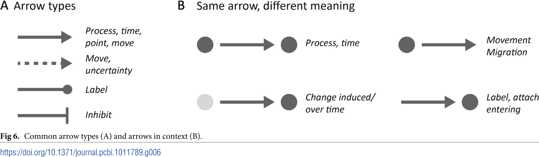
Actionable items
- Arrows connect text, pictograms, images and charts into a sequential narrative (storyline)
- Arrows have distinct functions and meaning (be consistent)1
- Respect domain-specific agreements (e.g. inhibition)
7: Text
Less is more

- Graphical abstract should be self-explanatory (without text)
- Be consistent (sizes, font-weight, font)
- Don’t overwhelm or confuse
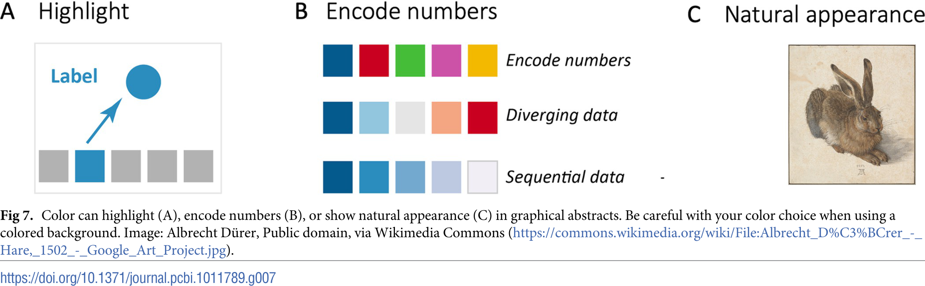
8: Colors
Colour is a power which directly influences the soul.
Actionable items
- Explore tools to select colors or color combinations
- Reflect your color choices
- Engage with audience; other functions: highlight, enumerate, group, levels, …
- Consistency in color usage is important (in graphical abstract and manuscript)
- Many people are colorblind
9: Tools for graphical abstracts
Select the right tool for the job.

Actionable items
- Get comfortable with a vector graphics program
- Use vector graphics
- Biorender, Canva, Figma, Adobe Illustrator, Inkscape
- Comprehensive reviews of features and pricing are available1
10: Before, during, after
Feedback
Actionable items
- Get feedback on your last figure and implement the suggestions
- Designing is an iterative process
- Seek input from friends and colleagues.
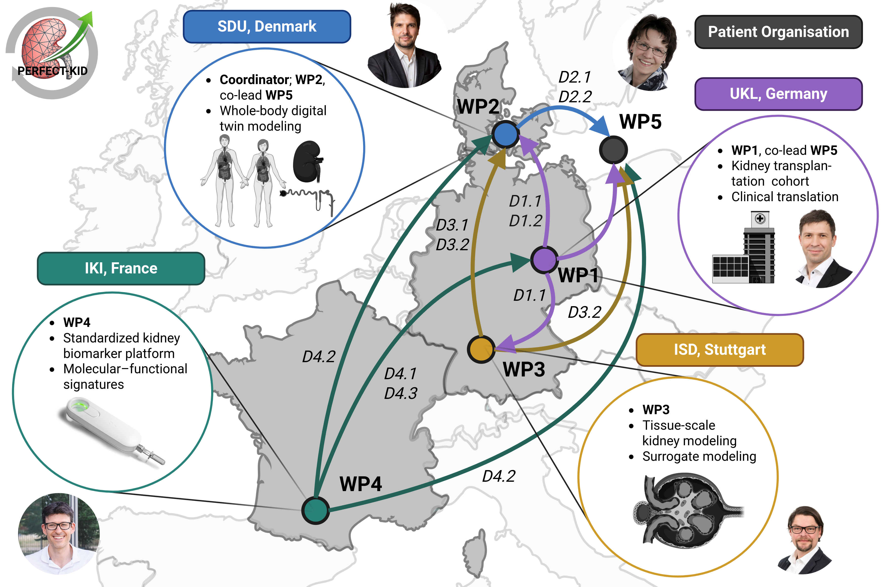
Evolution of Graphical Abstracts
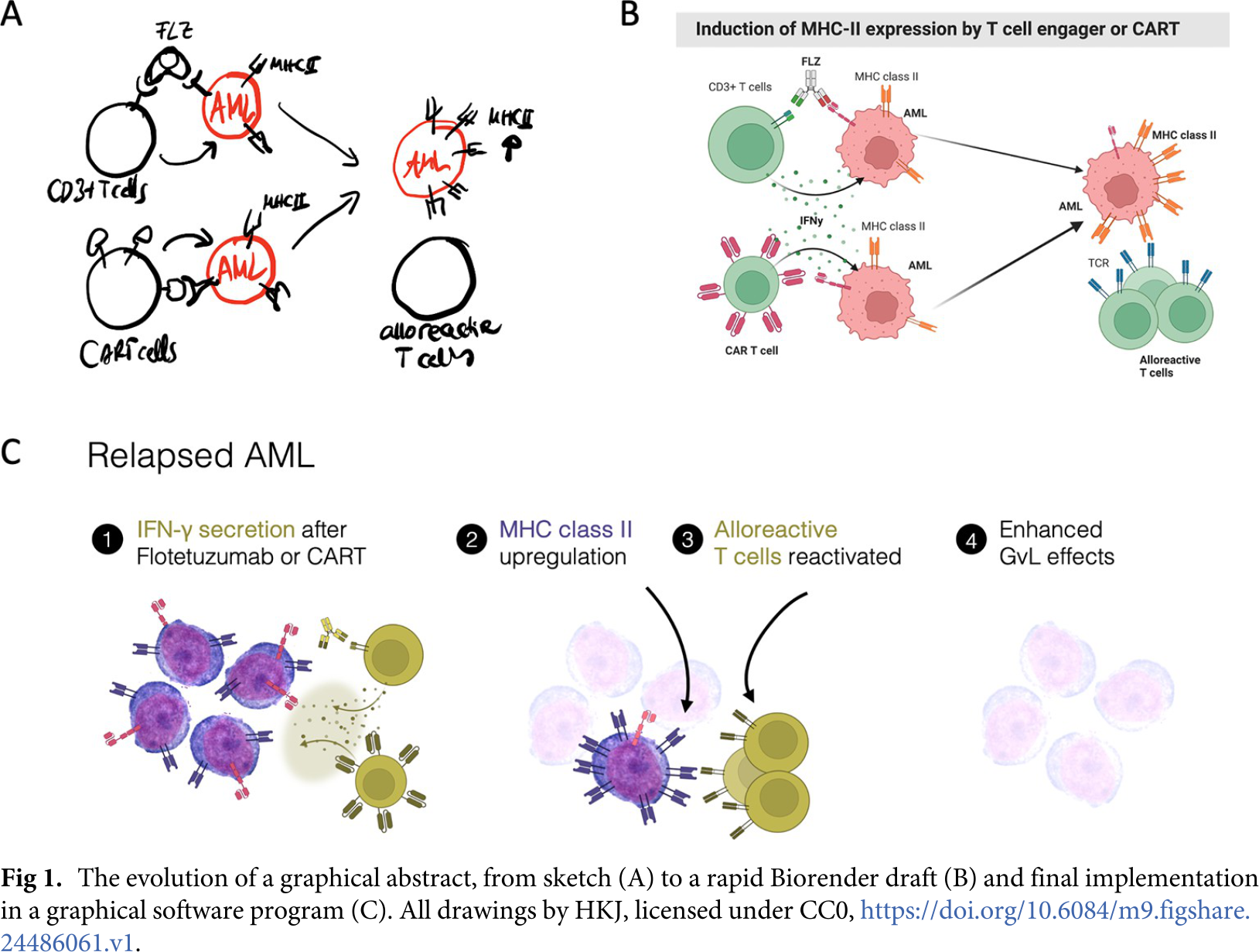
Evolution of Graphical Abstracts (PERFECT-KID)